Website Audit and Streamlining
How a redesigned user experience drove an 80% jump in sign-ups
Tools: Next.js, Hubspot, Figma, Google Analytics

Challenge
A D2C startup faced a puzzling situation: their website was attracting a lot of visitors, yet they were seeing surprisingly low levels of engagement and few sign-ups. Despite having a potentially interested audience, the conversion rates for their sign-up form were much lower than expected.
Data Exploration
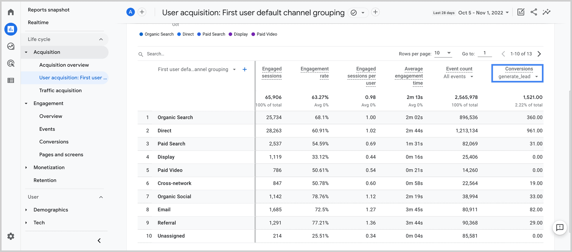
Our deep dive into Google Analytics revealed a key insight: while 20% of visitors clicked the “Get Started” button, only a fraction (20%) proceeded to complete the sign-up form. This meant just 4% of the overall traffic was converting, a figure strikingly low for our visitor base.

Example Google Analytics Acquisition Report
Root Cause Analysis: Pinpointing Friction Points
- Impatience in the User Journey: We identified an unnecessary redirection to the sign-up page as a friction point.
- Form Overload: The sign-up form was cluttered with fields. While additional information could benefit future marketing efforts, it was optional at initial sign-up. Although well-intentioned, the presence of optional fields contributed to an intimidating and lengthy appearance.
Solution: User-Centric Redesign
- We strategically relocated the sign-up form directly onto the landing page, streamlining the user experience.
- We reduced the form to its essentials, removing fields that weren't crucial for the initial engagement.
- For users directed to the sign-up page via CTAs elsewhere on the site, we added a positive and reassuring note, “You're one step closer to your $40 bag of laundry,” complemented by an encouraging image. This was to affirm their progress and direct them smoothly toward completion.
Impactful Results: Jump in Engagement and Efficiency
This redesign led to a significant surge in conversions, with an overall sign-up rate jumping to over 7%-- an 80% increase from the initial 4%. Additionally, sign-ups on the streamlined form page increased by 60%, thanks to the reduced fields and clear progress indication. These changes not only optimized the onboarding process but also significantly reduced the cost of acquisition, fueling accelerated growth.
This case study demonstrates the power of blending analytical insights with an empathetic understanding of user experience. It shows how a data-informed approach, combined with thoughtful design adjustments, can lead to substantial improvements in business outcomes.