Customer Onboarding Redesign
How analytical insights led to a 60% lift in conversion rates
Tools: Metabase, Figma

Challenge
A D2C startup was seeing a significant dropoff in their app’s user onboarding journey. Prospective customers were starting the account setup process but weren't completing it.
Data Exploration
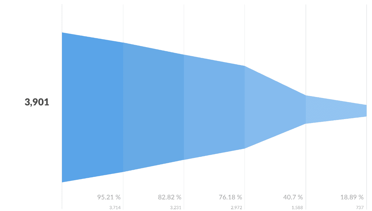
To address this challenge, we dove into the data. We used SQL queries to segment the onboarding journey into distinct steps, then visualized the process with a funnel chart in Metabase. This allowed us to see how customers dropped off as they moved through the different onboarding screens.

Example Metabase Funnel Visualization
Root Cause Analysis: Understanding User Experience
- Cognitive Load: Information-dense screens overwhelmed users, making the process laborious.
- Perceived Complexity: The multi-screen approach created an illusion of complexity, deterring users even when the tasks were straightforward.
- Impatience and Time Constraints: In today's fast-paced world, we realized that a lengthy sign-up process was a hindrance, particularly for users who were exploring the app casually or pressed for time.
Solution: Streamlined Sign-Up Process
- Transformed the onboarding experience from 5 screens to just 3.
- Non-essential information was eliminated from the initial sign-up phase.
- We streamlined the content on each screen, reducing word count to alleviate cognitive load.
- Auto-fill functionality was integrated to minimize repetitive data entry.
Impactful Results
The outcome was a remarkable 60% increase in the app's conversion rate. This not only made the onboarding process more efficient but also played a pivotal role in accelerating the company's growth.
This case study successfully demonstrates our approach: a blend of data-driven analysis, a deep understanding of user experience, and customer-centric design principles, all converging to drive substantial business results.